2015-02-25-miniassignment-YuTian
Mini assignment -- A visualized analysis of injuries involved in vehicle collisions in NYC.
Load libraries and NYPD data.
library(plotrix)
library(plyr)
library(ggplot2)
setwd("~/Documents/QMSS/2015spring/DataViz/miniassignment/")
crashes <- read.csv('crashes.csv', header=TRUE)
test <- crashes
year=as.numeric (format(as.Date(test$DATE, format ="%m/%d/%Y"),"%Y"))
month=as.numeric (format(as.Date(test$DATE, format ="%m/%d/%Y"),"%m"))
day=as.numeric (format(as.Date(test$DATE, format ="%m/%d/%Y"),"%d"))
test$year <- year
test$month <- month
test$day <- day
I. Total number of different injuries.
The following code calculates total number of different injuries.
injury_type <- cbind(sum(test$NUMBER.OF.PEDESTRIANS.INJURED),sum(test$NUMBER.OF.CYCLIST.INJURED),sum(test$NUMBER.OF.MOTORIST.INJURED))
colnames(injury_type) <- c("PEDESTRIANS","CYCLIST","MOTORIST")
A bar plot showing total number of different injuries.
barplot(injury_type, width = 1, border = par("fg"), axisnames = TRUE,
cex.axis = par("cex"), cex.names = par("cex.axis"))

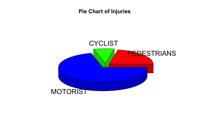
A pie chart showing proportion of different injuries.
# pie chart of different types of injuries
pie3D(injury_type,labels=colnames(injury_type),explode=0.1, main="Pie Chart of Injuries ")
II. Injuries chaning over time.
In this part, I will use a time series plot to show how rates of different injury types changing over time (daily).
First, use "ddply" "merge" to rearrage into a daily data frame.
PERSONS <- ddply(test, c("DATE","BOROUGH"), summarise, PERSONS = sum(NUMBER.OF.PERSONS.INJURED))
PEDESTRIANS <- ddply(test, c("DATE","BOROUGH"), summarise, PEDESTRIANS = sum(NUMBER.OF.PEDESTRIANS.INJURED))
CYCLIST <- ddply(test, c("DATE","BOROUGH"), summarise, CYCLIST = sum(NUMBER.OF.CYCLIST.INJURED))
MOTORIST <- ddply(test, c("DATE","BOROUGH"), summarise, MOTORIST = sum(NUMBER.OF.MOTORIST.INJURED))
data_daily <- merge(PERSONS,PEDESTRIANS,by=c('DATE','BOROUGH'))
data_daily <- merge(data_daily,CYCLIST,by=c('DATE','BOROUGH'))
data_daily <- merge(data_daily,MOTORIST,by=c('DATE','BOROUGH'))
data_daily$PERCENT.PEDESTRIANS <- data_daily$PEDESTRIANS/data_daily$PERSONS
data_daily$PERCENT.CYCLIST <- data_daily$CYCLIST/data_daily$PERSONS
data_daily$PERCENT.MOTORIST <- data_daily$MOTORIST/data_daily$PERSONS
data_daily$DATE <- as.Date(data_daily$DATE, format ="%m/%d/%Y")
ordered_data <- data_daily[order(data_daily$DATE),]
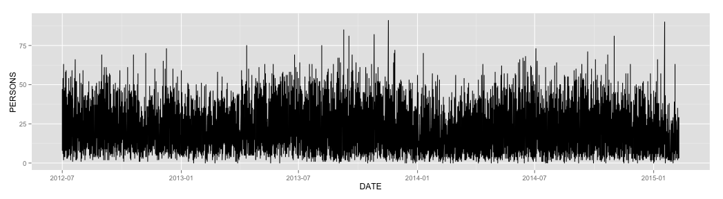
A time series plot of total injuries changing over time.
ggplot(ordered_data, aes(x=DATE,y=PERSONS)) +
geom_line()# basic graphical object
A time series plot of pedestrians injury rates from July to September looks like this: (grouped by different subdistricts in New York City)
ggplot(ordered_data[1:552,], aes(x=DATE,y=PERCENT.PEDESTRIANS, group =BOROUGH, color=BOROUGH)) +
geom_line()# basic graphical object
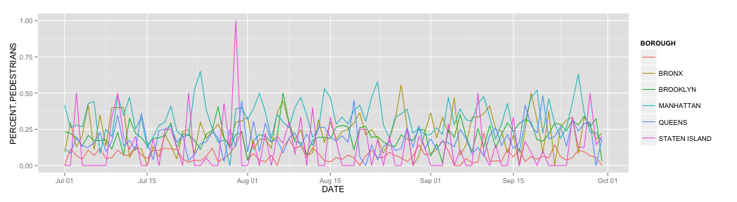
However, the chart is pretty hard to read... So I tried a bunch of different things in the next section.
III. Stacked bars.
The first thing I did is to reshape the data frame to get the monthly injury data for each subdistrict in NYC.
test_data <- test[,c("month","BOROUGH","NUMBER.OF.PERSONS.INJURED","NUMBER.OF.PEDESTRIANS.INJURED","NUMBER.OF.CYCLIST.INJURED","NUMBER.OF.MOTORIST.INJURED")]
PERSONS <- ddply(test_data, c("month","BOROUGH"), summarise, PERSONS = sum(NUMBER.OF.PERSONS.INJURED))
PEDESTRIANS <- ddply(test_data, c("month","BOROUGH"), summarise, PEDESTRIANS = sum(NUMBER.OF.PEDESTRIANS.INJURED))
CYCLIST <- ddply(test_data, c("month","BOROUGH"), summarise, CYCLIST = sum(NUMBER.OF.CYCLIST.INJURED))
MOTORIST <- ddply(test_data, c("month","BOROUGH"), summarise, MOTORIST = sum(NUMBER.OF.MOTORIST.INJURED))
monthly <- merge(PERSONS,PEDESTRIANS,by=c('month','BOROUGH'))
monthly <- merge(monthly,CYCLIST,by=c('month','BOROUGH'))
monthly <- merge(monthly,MOTORIST,by=c('month','BOROUGH'))
Now we can use the reorganized data frame to plot stacked bar charts for each type of injury.
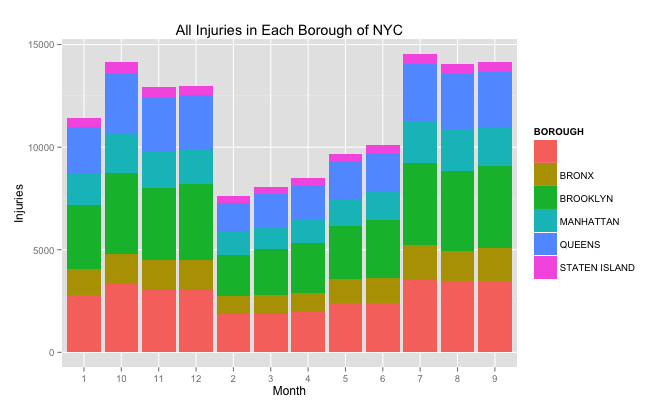
(1) Stacked bar for number of all injuries in 7 boroughs:
df <- monthly[,c("month","BOROUGH","PERSONS")]
ggplot(df,aes(x = as.character(month), y = PERSONS ,fill = BOROUGH )) +
geom_bar(stat = "identity") +
labs (titles = 'All Injuries in Each Borough of NYC', x = 'Month', y = 'Injuries' )
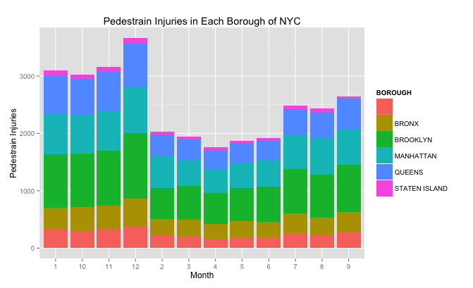
(2) Stacked bar for number of all injuries in 7 boroughs:
df <- monthly[,c("month","BOROUGH","PEDESTRIANS")]
ggplot(df,aes(x = as.character(month), y = PEDESTRIANS ,fill = BOROUGH )) +
geom_bar(stat = "identity") +
labs (titles = 'Pedestrain Injuries in Each Borough of NYC', x = 'Month', y = 'Pedestrain Injuries' )
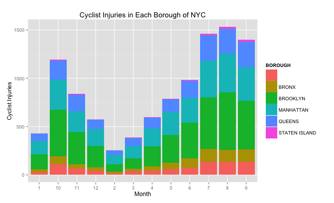
(3) Stacked bar for number of all injuries in 7 boroughs:
df <- monthly[,c("month","BOROUGH","CYCLIST")]
ggplot(df,aes(x = as.character(month), y = CYCLIST ,fill = BOROUGH )) +
geom_bar(stat = "identity") +
labs (titles = 'Cyclist Injuries in Each Borough of NYC', x = 'Month', y = 'Cyclist Injuries' )
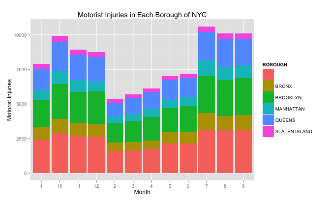
(4) Stacked bar for number of all injuries in 7 boroughs:
df <- monthly[,c("month","BOROUGH","MOTORIST")]
ggplot(df,aes(x = as.character(month), y = MOTORIST ,fill = BOROUGH )) +
geom_bar(stat = "identity") +
labs (titles = 'Motorist Injuries in Each Borough of NYC', x = 'Month', y = 'Motorist Injuries' )