CDC Disease Cases - ggplot, ggvis, and choropleth maps
CDC Disease Incidence Data Exploration
Overview
I started by pulling a sample dataset (Mumps) from the Tycho Project site to investigate disease rates over time. Starting from scratch, I needed to clean the data, aggregate the weekly data points into years, and then aggregate further into a regional view of Mumps cases. After building some exploratory plots in ggplot and ggvis, I also wanted to map individual state data into a choropleth style map to view relative frequency of disease in within a given year.
Full R Code:
## Load necessary libraries
library("reshape")
library("maps")
library("ggplot2")
library("ggvis")
library("dplyr")
## Read in csv file, skipping first 2 rows of header data, forcing column classes to integer, and converting "-" into N/As
Mumps <- read.csv(path.expand("~/Desktop/MUMPS_DataViz.csv"), header=TRUE, skip=2, sep=",", colClasses = "integer", stringsAsFactors=F, na.strings = "-")
## Replace all NAs with 0 values
Mumps[is.na(Mumps)] = 0
## Assign region groups by Federal region designations
RegionI <- data.frame(State= c("CONNECTICUT", "MAINE", "MASSACHUSETTS", "NEW.HAMPSHIRE", "RHODE.ISLAND", "VERMONT"), Region="RegionI")
RegionII <- data.frame(State= c("NEW.JERSEY", "NEW.YORK"), Region="RegionII")
RegionIII <- data.frame(State= c("DELAWARE", "DISTRICT.OF.COLUMBIA", "MARYLAND", "PENNSYLVANIA", "VIRGINIA", "WEST.VIRGINIA"), Region="RegionIII")
RegionIV <- data.frame(State= c("ALABAMA", "FLORIDA", "GEORGIA", "KENTUCKY", "MISSISSIPPI", "NORTH.CAROLINA", "SOUTH.CAROLINA", "TENNESSEE"), Region="RegionIV")
RegionV <- data.frame(State= c("ILLINOIS", "INDIANA", "MICHIGAN", "MINNESOTA", "OHIO", "WISCONSIN"), Region="RegionV")
RegionVI <- data.frame(State= c("ARKANSAS", "LOUISIANA", "NEW.MEXICO", "OKLAHOMA", "TEXAS"), Region="RegionVI")
RegionVII <- data.frame(State= c("IOWA", "KANSAS", "MISSOURI", "NEBRASKA"), Region="RegionVII")
RegionVIII <- data.frame(State= c("COLORADO", "MONTANA", "NORTH.DAKOTA", "SOUTH.DAKOTA", "UTAH", "WYOMING"), Region="RegionVIII")
RegionIX <- data.frame(State= c("ARIZONA", "California", "HAWAII", "NEVADA"), Region="RegionIX")
RegionX <- data.frame(State= c("ALASKA", "IDAHO", "OREGON", "WASHINGTON"), Region="RegionX")
## Bind regions into single dataframe
Regions <- rbind(RegionI, RegionII, RegionIII, RegionIV, RegionV, RegionVI, RegionVII, RegionVIII, RegionIX, RegionX)
## Aggregate data by week into data by Year
MumpsbyYear <- aggregate(Mumps, by = list(Mumps$YEAR), FUN=sum)
MumpsbyYear <- MumpsbyYear[-c(2,3)]
colnames(MumpsbyYear)[1] <- "Year"
## Transpose dataframe to make columns by Year
MumpsbyYearT <- t(MumpsbyYear)
colnames(MumpsbyYearT) <- MumpsbyYearT[1,]
MumpsbyYearT <- MumpsbyYearT[-c(1),]
## merge state names with Region definitions
MumpsbyYearTRegion <- merge(MumpsbyYearT, Regions, by.x="row.names", by.y="State")
MumpsbyYearTRegion$Region = as.character(MumpsbyYearTRegion$Region)
## Aggregate state data into Regional data
MumpsbyRegion <- aggregate(MumpsbyYearTRegion[2:37],by = list(MumpsbyYearTRegion$Region), sum)
colnames(MumpsbyRegion)[1] <- "Region"
## Use "reshape" package to melt data into long form (With Year as variable rather than a column header)
melt_MumpsbyRegion <- melt(MumpsbyRegion, id="Region")
colnames(melt_MumpsbyRegion)[2] <- "Year"
colnames(melt_MumpsbyRegion)[3] <- "Cases"
# Line plot of mumps cases over time, by region
ggplot(data = melt_MumpsbyRegion, aes(x = Year, y = Cases, group=Region, colour=Region)) + geom_line() + geom_point() + scale_x_discrete(breaks=c("1968", "1973", "1978", "1983", "1988", "1993","1998", "2003"))
## ggvis explorations
regionIDs <- as.vector(unique(melt_MumpsbyRegion$Region))
Years <- as.vector(unique(melt_MumpsbyRegion$Year))
melt_MumpsbyRegion$Year <- as.character(melt_MumpsbyRegion$Year)
## bar chart w/selectable Years
RegionBars <- melt_MumpsbyRegion %>% ggvis(x = ~Region, y = ~Cases) %>% filter(Year == eval(input_radiobuttons(choices = Years, label = "Years"))) %>% layer_bars()
RegionBars
## chart annual delta by region to see outbreak years
MbR1 <- MbR2 <- MumpsbyRegion
MbR1$Region <- NULL
MbR2$Region <- NULL
MbR2$"1968" <- NULL
MbR2 <- mutate(MbR2, 0)
rawYoY <- cbind((MbR2-MbR1),regionIDs)
rawYoY$"0" <- NULL
melt_rawYoY <- melt(rawYoY, id = "regionIDs")
colnames(melt_rawYoY)[2] <- "Year"
colnames(melt_rawYoY)[3] <- "YoY"
rawYoYLines <- melt_rawYoY %>% ggvis(x = ~Year, y = ~YoY) %>% filter(regionIDs == eval(input_select(choices = regionIDs, label = "Region"))) %>% layer_lines() $>$ add_axis("x", value = c("1968", "1973", "1978", "1983", "1988", "1993","1998", "2003"))
rawYoYLines
## Choropleth mapping explorations
## format state names to match "maps" library spellings
rownames(MumpsbyYearT) <- tolower(rownames(MumpsbyYearT))
rownames(MumpsbyYearT) <- gsub("\\.", " ", rownames(MumpsbyYearT))
## Weird hack - qplot won't read "fill" correctly if colnames begin/end with numerals...
colnames(MumpsbyYearT) <- paste("Y", colnames(MumpsbyYearT), "Y", sep = "")
## Import states data from "maps" library, and merge with Mumps data
states <- map_data("state")
choro <- merge(states, MumpsbyYearT, by.x = "region", by.y="row.names")
choro <- choro[order(choro$order), ]
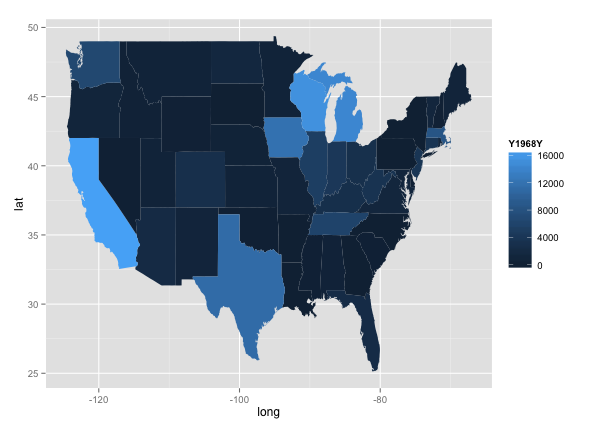
## Choropleth map of Mumps cases by state - 1968
qplot(long, lat, data = choro, group = group, fill = Y1968Y, geom="polygon")
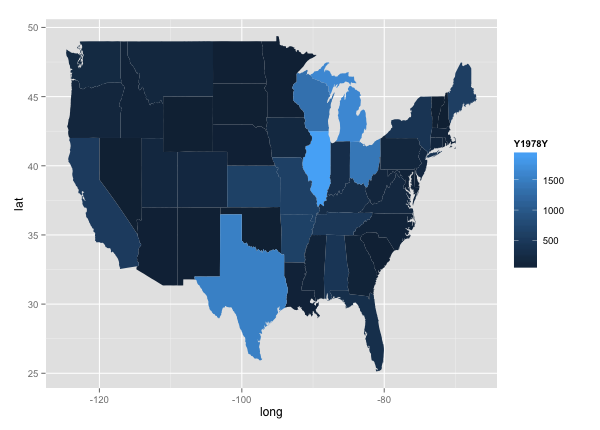
## Choropleth map of Mumps cases by state - 1978
qplot(long, lat, data = choro, group = group, fill = Y1978Y, geom="polygon")
## Choropleth map of Mumps cases by state - 1988
qplot(long, lat, data = choro, group = group, fill = Y1988Y, geom="polygon")
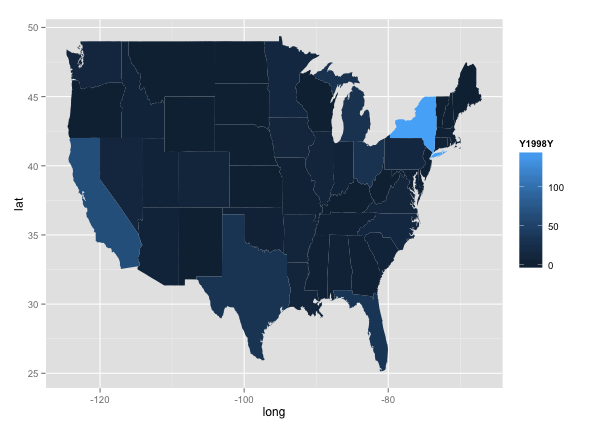
## Choropleth map of Mumps cases by state - 1998
qplot(long, lat, data = choro, group = group, fill = Y1998Y, geom="polygon")
Results:
After aggregating weekly data by Year and US federal regions, I wanted to get a broad overview of Mumps trends over time using ggplot.
ggplot(data = melt_MumpsbyRegion, aes(x = Year, y = Cases, group=Region, colour=Region)) + geom_line() + geom_point() + scale_x_discrete(breaks=c("1968", "1973", "1978", "1983", "1988", "1993","1998", "2003"))
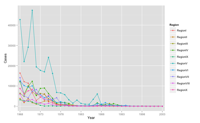
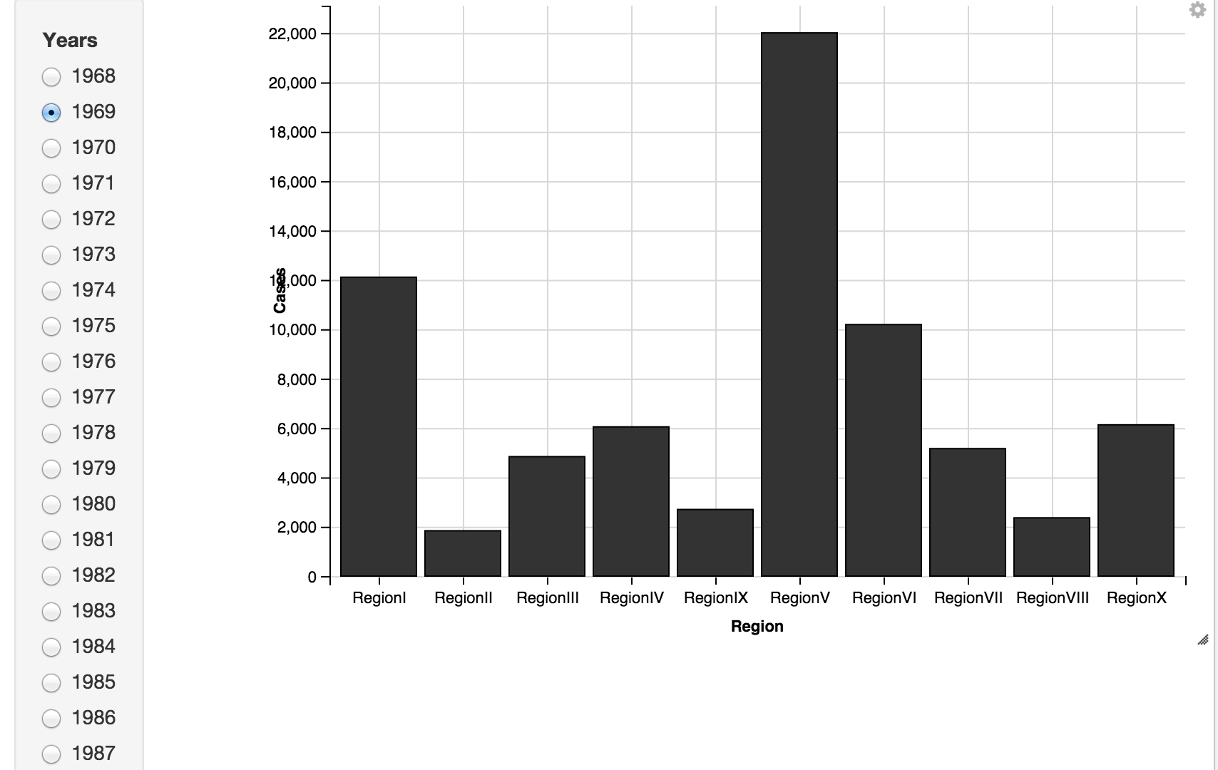
It's a bit hard to make out the finer details with multiple overlapping plots here. So I moved on to an interactive ggvis plot to view regional trends for individual years.
RegionBars <- melt_MumpsbyRegion %>% ggvis(x = ~Region, y = ~Cases) %>% filter(Year == eval(input_radiobuttons(choices = Years, label = "Years"))) %>% layer_bars()
RegionBars
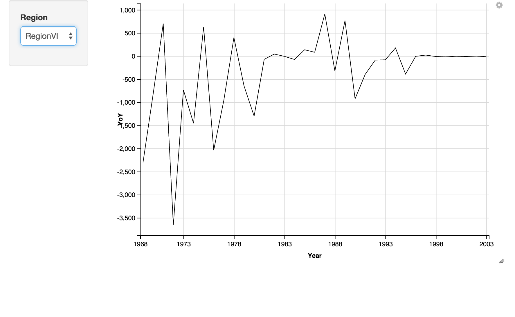
I also wanted to spot outbreak years by Region, so plotted the year-on-year delta in Mumps cases for each region. Oddly, ggvis bar charts don't allow negative values, so a line chart is used instead.
rawYoYLines <- melt_rawYoY %>% ggvis(x = ~Year, y = ~YoY) %>% filter(regionIDs == eval(input_select(choices = regionIDs, label = "Region"))) %>% layer_lines() $>$ add_axis("x", value = c("1968", "1973", "1978", "1983", "1988",  "1993","1998", "2003"))
rawYoYLines
Lastly, I wanted to map out state-by-state data over time. Using the choropleth graph in ggplot, I looked at disease levels across the country every 10 years.
qplot(long, lat, data = choro, group = group, fill = Y1968Y, geom="polygon")